A few things that I noticed when I was looking through his art work was it is very detailed, with faces on building and creative and funky. I would say it is also very colorful, and maybe even to much in one art work. I personally do not find it successful because I don't think many people would find it as amusing as he does. I think that it is to much and don't really understand why there are faces on buildings. The process to the art work I did was, rolling the dice to see how many building I had to put and that was 6, and then I did how many faces I needed and at the end I had faces on all of them. After that I added some hearts and windows along with a few birds. I finally colored it with the few markers I had, and I think it turned out pretty nice. I like how mine had enough color to it but also not to many. I don't think there was anything I didn't like about my art. 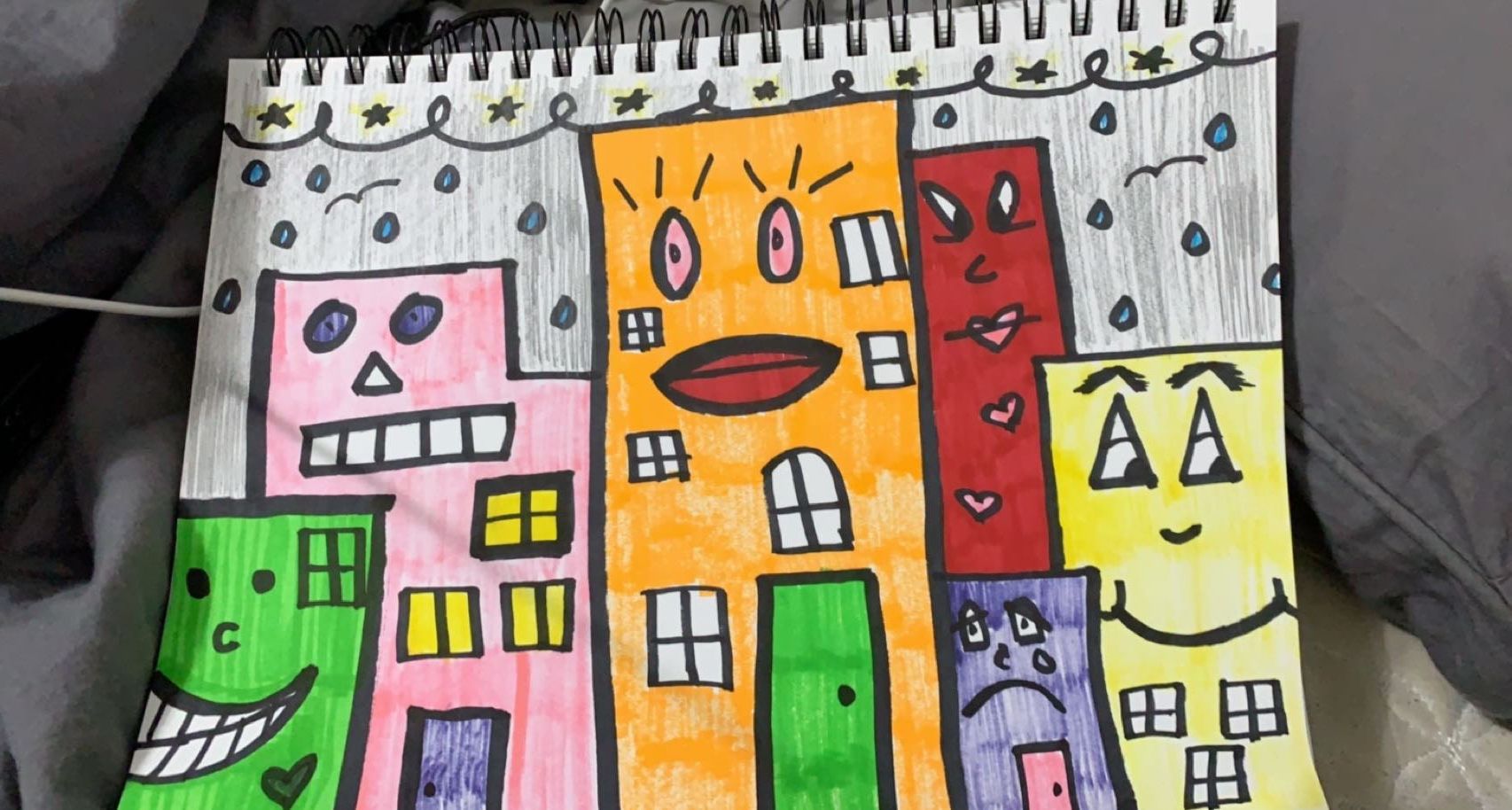
0 Comments
this artist describes his art as calmly and symmetrical as possible. the name of this artist is Joe Harriot, title of art was "summary". date created was 1962, he used paint brushes and paint.  7 principles of design include Emphasis, Balance and Alignment, Contrast, Repetition, Proportion, Movement and White Space.
7 elements of art include, line, shape, texture, form, space, colour and value Elements of art are stylistic features that are included within an art piece to help the artist communicate. |
Authorim danielle and i like tacos , and my favorite color is mint green/ blue Archives
January 2021
Categories |
 RSS Feed
